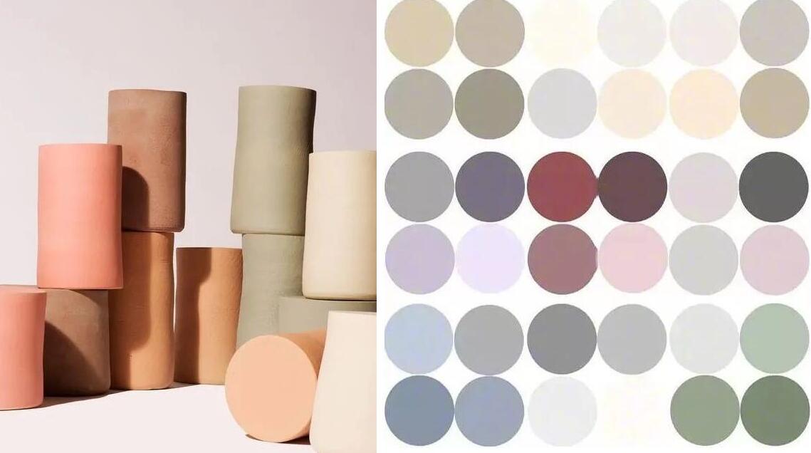
Morandi Colors: The Most Comfortable
Color
Morandi colors are derived from the paintings of Giorgio Morandi, a famous
Italian printmaker and oil painter.
All of us have seen countless colorful colors, however, how much do you
know about colors?
Is there one color that can give you a peaceful, elegant and pure feeling?
Yes, the answer is Morandi colors, a group of soothing and peaceful
color.
Morandi colors refer to a muted and
pale color palette, which is not bright as if covered with a layer of gray tone.
Morandi colors has rich connotation without a tendency to show off,
releasing the soothing elegance.
In this palette hue, everything is not flamboyant and quietly
shimmers the simplest charm and the direct inner happiness and tranquility,
so that the visual sense can achieve a perfect balance.
In his paintings, the subjects are simple objects that could be easily seen
in our kitchen, such as cups, plates, bottles, boxes and so on.
However, these everyday objects present a distinguished senior feeling
through different brushes and color combinations.
He abandons the personality of flamboyant color, infiltratesgray and white
tones in each color and transforms the original rich and gorgeous colors into
muted tones with elegant and advanced gray texture.
These muted colors are gentle and cold, but such a tone of the opposite
bright line makes the whole painting full of
mystery, giving people elegance, novelty, sincerity and
comfort.